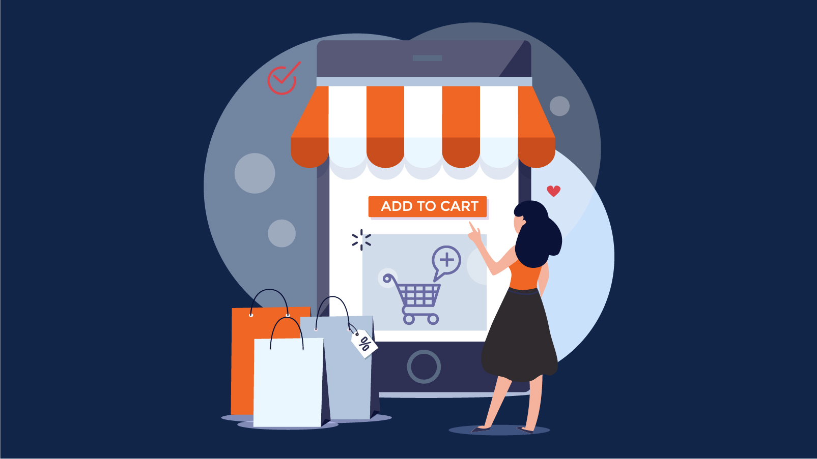
That little device you hold in your hand isn’t just for texting or social media. It’s quickly becoming the primary way to access the internet.
That makes the cellphone a critical tool for brands to interact with their customers.
As an eCommerce store owner, you know that having a strong online presence is vital.
You optimize for search engines, market your content, add high-quality images, and offer everything required to put your best foot forward in eCommerce business.
However, many of these steps are oriented around optimization for desktop. Optimizing for mobile is a whole different beast. To rise above your competitors, you need to dominate mobile.
MOBILE COMMERCE TRENDS AND STATISTICS
The most important thing about mobile Commerce is that it’s here to stay.
It’s projected that by 2021, mobile eCommerce sales will account for over 54 percent of all eCommerce sales.
However, a 2018 study found that only about 12 percent of consumers found online shopping on mobile devices to be convenient. Meanwhile, 67 percent of customers complain that pages and links are too small to click on when they access sites via mobile.
For eCommerce businesses, that means that more can be done to make mobile shopping more enjoyable and accessible.
The purchasing power is literally in the hands of your customers. Your goal is to improve your mobile visibility and put your business on their radar.
Are you tapping into the benefits of mobile eCommerce? Here’s how to get it right and optimize for mobile conversions through your eCommerce store.
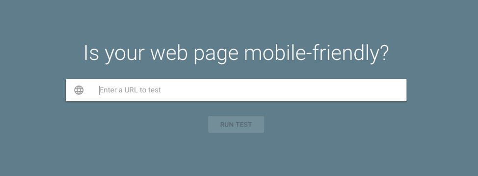
IS YOUR ECOMMERCE WEBSITE MOBILE-FRIENDLY?
The answer is hardly ever simply ‘Yes’ or ‘No.’ Every eCommerce website is a little different (or, very different), so there are varying degrees of mobile-friendliness.
That’s why there are online tools to assess mobile-friendliness, often on a percentage scale.
These tools consider:
- Image and Video Loading
- Text Visibility
- Page Loading Speed
- Clickability
- Use of Pop-Ups
- UI/UX
Many of these factors overlap. For example, the design of your website will often influence navigation (UX) and how long it takes for elements to load. This all plays a role in how users interact with your site.
CONSIDERATIONS FOR ECOMMERCE WEBSITES
As an eCommerce business, you have additional factors to consider. These include elements and images on product pages, what your checkout process is like, and how your website integrates with other applications.
The best way to tell if your website is mobile-friendly is to conduct a test of your website with a trusted online tool or get an audit from an SEO or web development professional.
If your website is loading slowly or customers are complaining about features on your site on mobile, these are clear indications that there is room for improvement.
HOW TO OPTIMIZE YOUR ECOMMERCE STORE FOR MOBILE
If your eCommerce website is falling short on any of the factors above, it’s time to optimize. Sometimes this involves minor tweaks to your website. Other times it involves an entire redesign. Your next move depends on the result of your mobile-friendliness test.
here are mobile optimization best practices that can be applied across the board. And, if you are starting a new website, we recommend considering these from the very beginning.
Magento for Mobile makes this process even easier for eCommerce businesses. Mobile-friendly checkout, responsive themes, progressive web applications, and more are all built into the platform. No need to wrestle with complicated code or optimization tools.
1. Responsive, Eye-Catching Website Design
Your eCommerce website may look great on desktop, but the mobile version may leave much to be desired.
If you visit your website on your cellphone or tablet and part of the design is cut off, doesn’t load properly, or makes it hard to click on certain elements, you will need opt for a more mobile-friendly design.
Some eCommerce platforms (such as Magento) have this built in. But, if that’s not the case for your platform, it’s best to work with a web designer.
2. User-Friendly Navigation
Your online store should not only look great, but work perfectly. At the very least, users need to click on the important elements on your site such as the Main Menu, pages, posts, and links.
Often, navigational features are limited by a mobile design. You may not have room to include all of the tabs and pages that are included on the desktop of your site.
You should ensure that the most important pages on your site are easy to find, accessible, and clickable. This will encourage users to stay on the site longer.
3. Fast Website Load Times
There are few things more annoying (and conversion preventing) than a slow website.
If a user lands on your site and it takes too long to load, they will go elsewhere. Imagine the lost sales.
Your website should load in under three seconds, ideally less than two. This may not seem like much time at all, but even a second can make a huge difference. You can improve loading time by optimizing your images, reducing the amount of content on your site, using a caching plugin, and implementing the AMP protocols. These protocols ensure websites are consistently fast, beautiful, and high-performing across all devices and platforms.
4. Intuitive Checkout Process

Your goal is to move users along your sales funnel and get them to buy your products. Unfortunately, having a checkout process that is not optimized for mobile can slow things down.
eCommerce websites have unique capabilities that other websites do not. You can fulfill orders, process payments, and more. The steps for collecting information from customers should be as intuitive as possible.
Remember that mobile devices have much smaller screens than desktops. This means your content should be concise, your buttons bold and clear, and your forms/fields easy to fill out. If the page keeps re-formatting or is too small for the user to fill out, they will likely give up and leave your site.
5. Optimized Images and Videos
Images and video on your site makes your store more engaging and helps users understand your products. They can also significantly affect website loading times. If your fancy files are too large, they may not load at all.
Your images should be clear and use the appropriate sizing for your design. You can work with a designer to optimize your image sizes for mobile.
Ecommerce videos should be the right size to be fully viewed on mobile and should not autoplay. The less invasive your website content, the better.
6. Eliminate Invasive Pop-Ups and Ads
Have you ever visited a website just to be bombarded with pop-ups, opt-ins, and “special offers”? Annoying, right?
Your potential customers think so, too.
For this reason, Google is cracking down on websites with invasive pop-ups and ads. If these features create a bad experience for users, Google is less likely to show your commerce website in the search results.
While it’s a great idea to try and grow your email list and present customers with your latest deals, on mobile, less is more.
7. Reduce Heavy Content
High-quality content is important for SEO and for staying consistent with your brand messaging. It’s also necessary for encouraging users to learn more about your products and business.
However, too much can really bog down your site – especially if it’s hard for users to view it on mobile.
Open your website on your mobile device and check that none of the content is cut off. Also think about what your reading experience. Are there too many blocks of text? Weird spacing? Too much white space?Fixing these issues will make a huge difference.
INCREASE COMMERCE CONVERSIONS ON MOBILE
Customers are using mobile devices to find goods and brands online, no matter where they are. As an eCommerce brand, this gives you the opportunity to take advantage of mobile SEO and attract more users to your website.
If you have been sleeping on mobile optimization, now is the time to wake up and get ahead of the game. With so many potential customers looking for products like yours on mobile, you can’t afford not to get a piece of that pie.

You should ask yourself:
- Is my website attractive and easy-to-use?
- Are your images, and videos, and other content loading properly?
- Can users easily click on the pages and links on my site?
- Does my website load quickly and without errors?
- Is the checkout process easy to follow?
- Am I creating an experience that my potential customers will enjoy?
Mobile optimization for Commerce is about considering the user’s experience and making it as easy as possible for them to find what they are looking for. You don’t want any design or functionality issues to get in the way of you making a sale.
Take advantage of the power of mobile for Commerce by optimizing your website.